A Personal Reflection

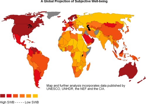
Overall, English 212 has exposed me to different aspects of writing in terms of maps, lines, info-graphics and other data visualizations that have become apart of our constantly evolving society. Personally, I have come to realize the persuasion behind each of these various forms of data visualizations and the necessary purpose to look at different aspects in terms of purpose when viewing each. Data visualizations, in their own way have a great aspect of rhetoric to them. To clarify, data visualizations are much more than attraction for the reader, but when analysed in-depth, they have the ability to display much more information, along with persuasion than at a first glance.

Furthermore, my relationship with writing has been broadened due to the ability to apply my own personal opinion, as well as gain better skill in the area of learning to accept others opinions. Since January, I have noticed myself making connections to other courses I have taken, as well as developing an open mind to criticism in opposition to my biases. Nonetheless, I have now learned to take a broad subject or topic and had found a path to narrow down my ideas to focus on. This aspect has dramatically changed my writing as I now am limited to a central focus, instead of my old way of ‘jumbling’ to get all my thoughts down within limited parameters.

In terms of my writing style, I have matured in both my text-based work, in addition to my development with data visualization pieces. By this, I feel that I have taken a set away from accepting data visualizations that are seen as traditional and succeeded in putting myself into a cartographer, designer, or authors shoes. Prior to this course, I did not realize the impact of data visualization and was solely focused on making my in-text work sound more professional and complex. In one way, I now understand the many ‘purposes’ that an individual data visualization can display. In addition, I have found a better outlook on how data visualizations can be utilized in all different forms to prove a point or to be informative for my readers/ viewers. In a different perspective, when I look at data visualizations that have been created by others, especially my classmates I have learned how to respectfully critic their information or opinions, and I feel we have bonded over the ability to bounce ideas off of each other.

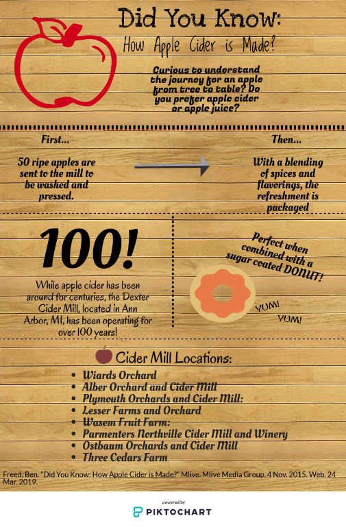
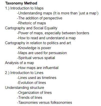
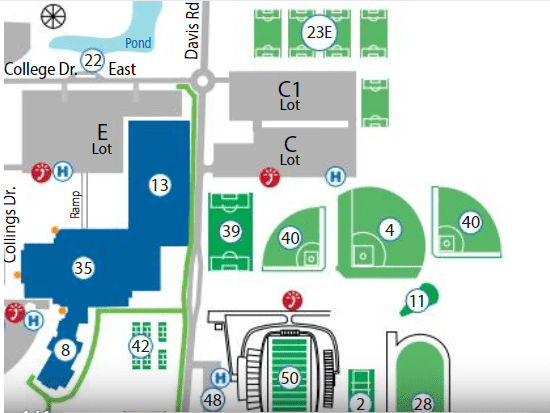
Correspondingly, this course challenged me in that I had to learn to write text-based pieces in addition to learning to create different data visualizations such as blogs, taxonomy/folksonomy, info graphics, maps, and so on. It has appeared to me how much more attractive text-based writing becomes when data visualizations are implemented in addition to. My attitude to towards writing changed in that I see writing with data visualizations as intrinsic to my education. My definition of “text” has changed along with my attitude. I now refer “text” to be my explanation to a image or data visualization. “Text”, to me, is another feature of persuasion that I will implement in my future pieces of writing. Looking back on my growth throughout this course, I would now describe my writing style as articulate, informative and conversational.

For the future, I hope to continue to grow as a writer, in terms of analyzing and informing. As a reader, I will continue to question all perspectives of different works of art and text-based writing. In conclusion, I would like to thank my professor for exposing me to the different perspectives of writing, as well as my classmates for their continuous feedback on my writing/ opinions.

A New World of Data: A Revolutionizing Response

In a brief summary of D’Iganzio’s perspective that “Data visualization (is) one more powerful and flawed tool of oppression”, it is necessary to understand the points that lead up to this point of view. To clarify, D’Iganzio’s article addresses the powerful amount of rhetoric that is present through data visualizations. In fact, data visualizations have become generalized to that point that much of the information that creates our perceptions has become misconstrued in one way or another. Specifically, data visualizations have been generalized in form to be appealing to certain audiences, genders, or small groups of people for one purpose: to persuade. D’Iganzio argues through the reflection of cartographers, mapmakers, and other analytics how data generalization can be avoided. In addition, D’Iganzio proposes three different solutions to the initial issue of data visualization becoming generalized: including missing information that has been lost through data generalization, making data references to become more reputable and connectable with the ‘real world’, and re-situating data to become interactive. After all things presented within D’Iganzios article, “Feminist Data Visualization”, it is apparent the need to reconsider how information is presented to different audiences, and to find a “Neutral point of view”.

{Link to particle: https://civic.mit.edu/2015/12/01/feminist-data-visualization/ }

In response to D’Iganzio’s article, I completely agree with the perspective that data visualizations are misrepresented. I have found throughout my college English class that the accessibility to information is more often than not influenced by biases and much of the data that is meant to be represented is left in the dark. Furthermore, I can agree that data visualizations are often presented to add to opinions of particular groups of individuals, but I have yet to experience data visualization to the extent of oppression. As a matter of fact, I believe it to be a societal issue to take only the information of one data visualization, rather than an issue of how information is presented. To clarify, I have found data visualization to be so readily available from the advancement of technology, especially online sources like Google that it has become an excuse for society from digging deeper into the information that they are receiving.  As a result, individuals are already at a loss from retaining all aspects of a data visualization set due to the internal instinct to settle for less.

Correspondingly, within an novel discussing the world of “Big Data”, it is presented in an abstract way, the idea of a hypothesis driven approach. To understand the connection between  data and data visualizations, I think it is very overwhelming the revolutionizing way data is being analyzed. Continuing, data was once looked at to be utilized for a cause and effect result, much like how data visualizations are utilized to show a trend of information or to add to a topic. Now, as technology becomes the new way of how the world operates, the overabundance amount of data does not have a direct relationship with an effect like it once did. In a produce/consumer world, it is inefficient to decipher every piece of data that presents itself, so only parts of data are actually being analyzed for the purpose of selling more product or producing more goods. On the other hand, data visualizations in their popularity must be analyzed in their entirety, each for their own biases, purposes, and missing information. All in all, it is imperative to look at different aspects of data and/ or data visualizations and depict them for their purpose and the surrounding influences that may lead them to be misconstrued.

Reference: Mayer- Schonberger, Viktor and K. Cukiek. “Big Data: A Revolution That Will Transform How We Live, Work, and Think.” (2013).

A Farm Fresh Infographic

Reflecting on the different ways to tell the same story, it is apparent that data visualization is key to luring in a reader/ viewer. As demonstrated above, I took two different approaches to displaying information. In one way the article link above, titled, “Did You Know: How Apple Cider is Made” by Ben Freed, provides the information necessary to the reader in paragraph form of the process, history, and locations of Ann Arbor, MI cider mills. From this article, I utilized my design skills to recreate the information provided in the article to produce an inforgraphic. To do this, I took the highlights of the article and summarized them into captions, along with graphic images to become more attractive to the reader. I selectively included icons that were simple and representative of the article. In addition, I only used short burst of context that was directly drawn from the article.

There are many pros and cons to utilizing different methods of displaying information. For instance, the article is much more informative than the infographic. This is largely due to the fact that the infographic was drawn from the article and only allows the reader to visually see the information that the designer utilized. On the other hand, the infogrpahic is capable of drawing in more viewers due to the pictures provided and the less overwhelming feel of the information being displayed. The overall objective of this comparison was to analyze how different perspectives/ ways of displaying information could be simplified and to see the effectiveness of each.

In terms of persuasiveness and effectiveness, the infographic surpassed the test. Continuing, the infographic was able to supply viewers with the information in a timely manner and without strenuous comprehension. The infographic was much more appealing with the utilization of pictures and without the intervention of advertisements listed in the margin. Lastly, the infographic was less overwhelming, thus making it more persuasive because of the interest in obtaining information without much thought.

In the end whether utilizing the article or infographic, it is important to note the differences of each data visualization perspective, but even more important to understand the process of an apple to become apple cider.

A Structure of Success

What type of person are you? The kind that likes to map out their daily lives and breaks it down into order by importance, or the opposite, the type that goes with the flow and likes a more relaxed schedule? The difference between these two types of organization/ structure can be defined by either taxonomy or folksonomy. Taxonomy, in essence, is a method of classification that is organized by dividing larger ideas or tasks into smaller, simpler categories. On the other hand, folksonomy is a network of ideas and tasks that are collected together, in no specific structure. Ideally, to display these different forms, it is necessary to identify the appropriate classifications that will be displayed by each different organizer. To recreate a taxonomy structure, it is ideal to highlight the larger topics and then break them down into simpler categories that are more detailed. For a folksonomy structure, the big idea is not broken down but added to with a variety of selections that pertain to the main topic. In reality, no tools are needed to create either form, but it is empirical to understand the material being organized, thus each organizational method can be utilized to its full capacity.

Folksonomy Method (Above)

In the experiment conducted above, I demonstrated the difference between a taxonomy versus the folksonomy organizational methods. To further explain, I first began by taking the information I received in my English course and organized it by the main topics discussed in each module. Then, I broke them down into simpler categories based on the information that I received from each module. In essence, this organizational method was strictly focused on a weekly schedule and the review of each individual topic. By the end, the taxonomy method looks representative of a tree. On the other hand, to design the folksonomy diagram, I took multiple blog posts, as well as adding in vocabulary from other quizzes and assignments. I then was able to plug this information into a word bank generator that created a diagram that represented a cloud. From this, I was able to see the big picture that my professor was trying to familiarize us with. Overall, the folksonomy and taxonomy methods work hand in hand with each other. It was significantly more difficult to recall all of the individual assignments and topics that were covered in the taxonomy method. In support of the folksonomy method, the word cloud allowed me to see an ariel view of everything that I had discussed, thought and noticed about the concepts that I had analyzed.

Personally, I liked the folksonomy diagram. To support my opinion, I felt that the folksonomy method was very appealing to the eye and allowed me to not only focus on the overall learning lesson but also reflect on previous assignments. I felt that this diagram allowed me to better understand the purpose of giving my best effort, and allowed me to appreciate the journey that will lead to the next concepts being discussed. From this experiment, I have a greater appreciation for observation and critical analysis. From now on, I will utilize the folksonomy method in my daily life, especially when I face times of stress. I will force myself to understand the end goal, instead of focusing on the individual obstacles that can stand in my way.


The Power of Maps…

For this particular post, I thought I’d point the focus towards athletics at Saginaw Valley State University. For the thousands of college tours that happen each year, many in which are directed towards Saginaw Valley’s Ryder Center. This center provides for a fitness center, track, indoor field, and lots of other amenities for Saginaw Valley athletes and students alike. For prospecting students comparing campuses, SVSU ensures that your health is a top priority.

In the map below, I recreated directions to reach the Ryder Center. From this map, it can be demonstrated the way power functions, influencing the purpose of maps. For instance, this map has the power of marketing and persuasion. This map, in particular, is a great advertisement resource for the upgrades Saginaw Valley is continuously implementing. In addition, this map is drawn with clean lines and a modern look/ feel, so Saginaw Valley can appear to new students as a welcoming environment. Notice, that by eliminating the negative space to focus on the areas dedicated to athletics, the map appears to be less overwhelming as compared to the original version. Nonetheless, the formatting of the map shows the large area claimed by the Ryder Center. It is apparent simply by enlarging the map the importance of Saginaw Valley’s athletic facilities.

In comparison to the original version of the Saginaw Valley State University map, it can be noticed the ability to distort a map to interest a particular group. In this case, my focus was on luring in incoming athletic students. For students committing to Saginaw Valley for athletics, the revised map is very appealing to prove convenience for practices. Even for students that do not play a sport, the revised map can be intriguing as a way to network at sporting events and/ or demonstrating school spirit! After all things considered, did the power of this map persuade you to become a Cardinal?

(Original Version Map of Saginaw Valley State University)

(Recreated Saginaw Valley State University Map)

Post #1

This is where I begin…

I began this blog with the intent of sharing the life experiences that have shaped me into the person I am today, but it appears that there have been many thresholds that have intervened in my life. For me, my current English class at Saginaw Valley State University is one of those thresholds. While this class was a priority to obtain my degree, I hope it will shape me into a more confident writer. I hope that I will be able to find a connection to my passion for history as a guide to the content I will be learning in the future. This far, I am extremely intrigued by the social conditions that have shaped our society. Last semester, I took a course in Sociology that completely changed my perspective on race, feminism, and nationalism. From taking that course, I realized how undereducated and bias society was and is. I am hopeful that I will be able to continue on my path of growth in knowledge and my writing skills to be able to blog my thoughts and ideas for others to ponder.

Thought one: Maps function in a rhetorical way.

Image result for interesting map projections

http://thomaspmbarnett.com/globlogization/2008/1/15/interesting-map.html

Above is a map that I personally found very interesting. It appears, according to the map that the shape of the world is based on the average subject well-being, or the state of comfortable, happy and healthy of individuals living in a particular area. As you may notice, Africa makes up a large portion of the world’s continents. In correlation, Africa houses the mediocre or the average person. In comparison, the western part of the map, including the United States demonstrates that the world is living with a high subject well- being. How is this map determined? Is it reliable?

After viewing a clip from West Wings and reading an article about map projections, I realized that maps are very much misunderstood. For instance in geography, specifically maps of the world people are quick to think in the mindset of what is traditionally accepted. People are often resistant to change but it is too often proven that individuals put their trust in others that do not have any reliable information or truth behind their motives. Based on sources given to me by my English Professor, personally, it is to my belief that ideas are morphed to be in the benefit of the writer and/ or speaker. For me, my opinions were particularly broadened after viewing a Youtube clip that comically judged the way societies opinions are made. First impressions, for instance, are incredibly easy to believe and are often false, or wrong characteristics of a person. Now, think of a map. It was incredibly easy for me to Google Search a random map and pick one for presentation. This map, in particular, I chose due to the fact that it has been published by an individual I have never met, nor heard of. While, as a viewer, we can never be certain that a map is completely reliable, it proves just how easy it is for an individual to be misled or for it to be misunderstood. For any audience, they are at a disadvantage to ensure the full content is a dependable representation of an issue. To support my main point, that maps are biased and rhetorical, this map shows without a doubt that it is possible that our world has been misconstrued by our observations and the information that is only known to the author. In correlation, this map is very similar to the one that much of societies education is based on. Have you ever considered if the Earth was square? Is water even wet?

Authors, Wardle and Adler-Kassner suggest that writing expresses and shares meaning to be reconstructed by the reader. In other terms, the writer can intend for their piece to be interpreted in one way but can be misread by the reader. While the writer can never be fully aware of the reader received what he/ she was trying to portray, it is the reader who carries on the meaning whether or not it is the correct meaning. This same connection between the writer and reader can be applied to maps and geography. The map I presented above is intended to prove to individuals that there is a correspondence to the size of a continent, the people that inhabit an area, and the overall satisfaction of such groups of people.  While there isn’t enough information to prove this graphic to be incorrect or correct, the map appeals to readers of certain moral beliefs. In one way, the viewer can adjust the map to understand that certain parts of the world would be sought as an ideal place to live. In another way, this map can be used to represent the inequality between the living condition and quality of life, or the scale in which a majority of the world is living a mediocre lifestyle and only a percentage are presented with a better or worse lifestyle. Whether or not everyone sees each of these perspectives, it is unknown to the reader which position the writer was trying to demonstrate.

Maps and graphics appeal differently based on the rhetorical appeals presented. For instance, the map- maker may be ethical driven to demonstrate the well- being of individuals who reside in a particular country. An example of this, the United States is portrayed as having citizens who are happier and healthier than individuals that reside in Africa. The ethics of the designer may have been exaggerated to incorporate wealth as a factor of subjective well- being. In addition, the audience’s emotion may play a factor. If this map were presented at a convention for support of United States Foreign Aid, it is apparent that audiences would be more adamant to send support to areas where citizens are facing significantly less suitable of a lifestyle. Another emotion that audiences may experience when viewing this map includes superiority or nationalism. Either way, the map inflicts emotions that are presented based upon the audience. Finally, whether or not the map is presented clearly and with logic, plays a key role in which degree the map will have influence. This map, in particular, is clearly color coordinated and includes a key for reference. In all aspects, maps can be misconstrued based on the rhetorical appeals that are used when being presented.


About Me!

A brief insight into my life:

My name is Haley and I am currently a college student pursuing a degree in General Business! I am in the beginning stages of pursuing my degree in business but have fulfilled my life with a variety of ways to take a break from studying. I have begun this blog with the intent of sharing my personal life experiences that I have found fulfilling. I hope that my viewers can feel the same passion for writing that I have found!

“You can’t climb the ladder of success with your hands in your pockets”

– Arnold Schwarzenegger

Image result for writing